Although we may not always know where our writing paths will lead us, if we follow our passions, we usually end up somewhere pretty great. Alum Kate Estrop discovered a joy for writing short comics after receiving their MFA in Fiction from Lesley University, which has since blossomed into a career in graphic design–although they still frequently use their writing skills. Read on to find out some of their favorite projects, their work with the Bisexual Resource Center, and what they’re currently working on.
KATE ESTROP – FICTION, JUNE 2010
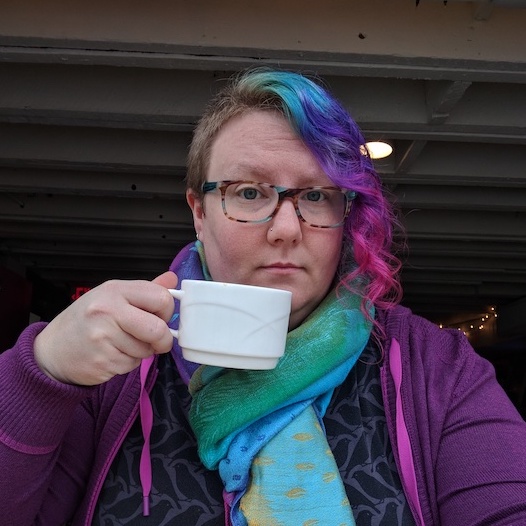
KATE ESTROP is a graphic designer and illustrator who started their creative career writing depressing short fiction. After realizing how incongruous this was with their personality and life outlook, they swapped their keyboard for a stylus and started drawing cute animals and designing resources to help people. Now, they use their writing and design skills in marketing, customer success, and outreach, and can also be found walking around Somerville, MA with their macro lens looking for bugs.
Interview by
Julia Leef
What were some of your earliest literary inspirations that guided you towards a desire for creative writing?
I don’t think I saw a connection between reading and writing early on. I did more writing (and drawing) than reading, for sure. In elementary school I’d rather be outside, and later I’d rather be holed up in my room filling yellow legal pads with stories (mostly older versions of myself with highly unrealistic jobs and apartments) than reading books. Even in high school, when I decided I’d probably major in creative writing in college, I read sporadically, preferring to spend more time with friends, doing drama club or other social activities. I read because I wanted to read, and I wrote because I wanted to write. I had a desire to go into creative writing because I liked to write, and it wasn’t until I studied the writing of others at a critical level in undergrad that I linked the two.
But I did have my favorites as a kid. Though I didn’t consider myself a “reader” growing up, my mom was (and still is) a book freak. We’d go to the library every week to refresh our big stack (and for my mother to pay her inevitable late fees). She still has many of the picture books we read and I grew up learning to read myself (one of my favorites is The Little Mouse, the Red Ripe Strawberry, and the Big Hungry Bear and my Dad’s favorite is Rotten Ralph). As picture books went, I liked the ones starring animals the most, even if those animals just stood in for kids like me. These picture books have inspired me indirectly in the narrative illustration I do now, be it for myself just doodling in a notebook, for a commission, or for short comics I make, even though I didn’t get into reading comics until I was an adult.
We also had Shel Silverstein’s collections: A Light in the Attic and Where the Sidewalk Ends. As a child, I laughed at Silverstein’s fantastical characters, settings, and situations. Now, I can see how some of that style has made its way into projects in little ways, like the packaging copy I wrote for a branding concept project at MassArt. I tend to lean toward the absurd and quirky in many parts of my life, and I’d like to think Silverstein started me out on that path.
I have Silverstein’s books as well! I always appreciated how he could get across such poignant meaning through simple poetry. Many of us upon graduation find ourselves using our writing skills in unexpected ways. Can you expand on how you’ve used your writing, such as your work with MassArt or with short comics?
I started writing short comics a few years after my MFA, while I was an English and writing adjunct at Lesley. The creative energy of the undergrad art students at Lesley must have been contagious. I’d always liked to draw, but it was around this time that I decided to really devote myself to a practice, rather than just sit down with a sketchbook and pencil when I felt like it. I took a comics-writing class at the Cambridge Center for Adult Education and really liked the idea of wrapping up a scene or story within a few pages, using words with images (and sometimes only images!) to convey emotion and plot. I realized this is what I’d always wanted in writing: literal boxes to contain me. They made the blank page feel less scary.
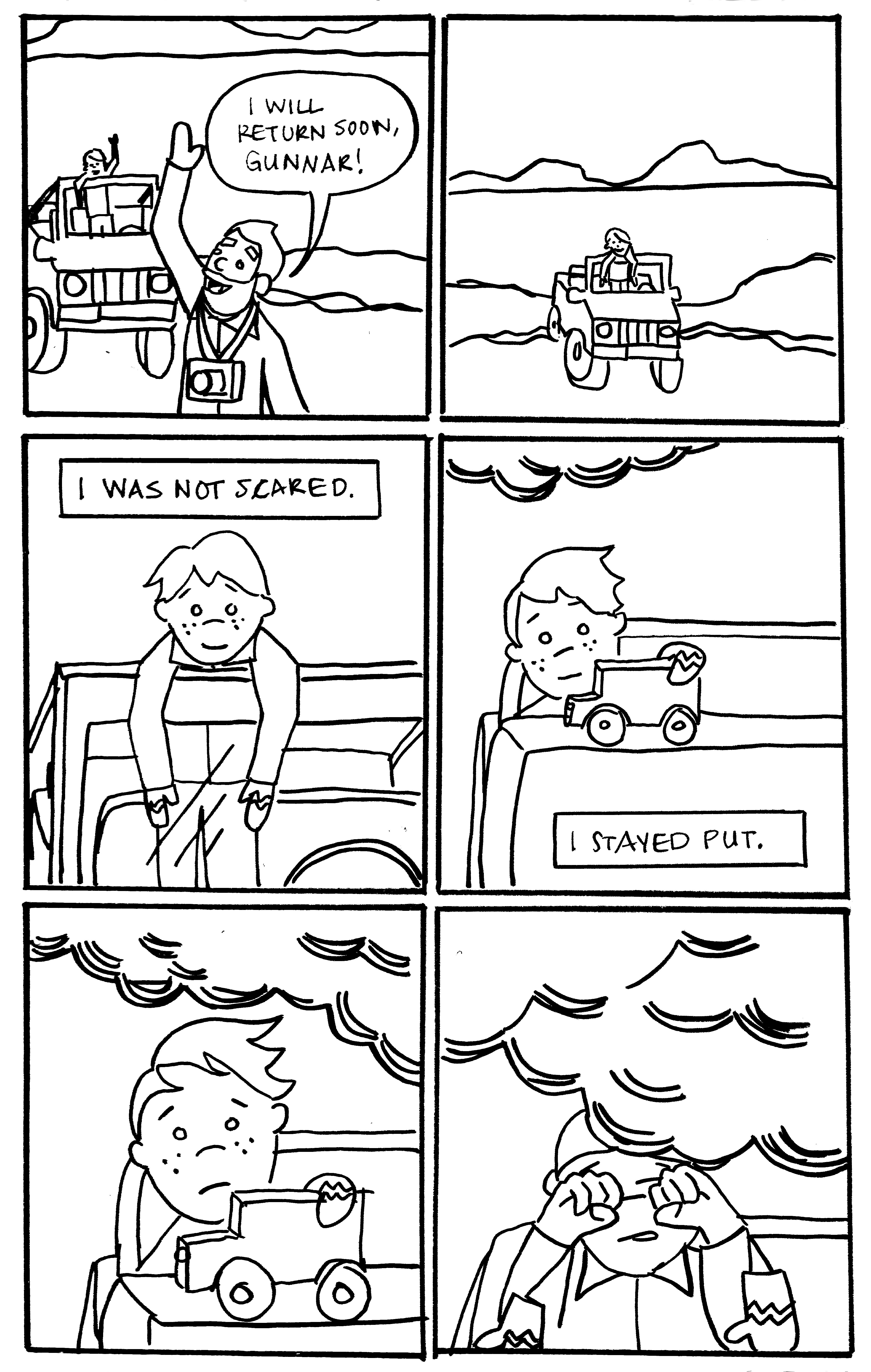
The first multi-page comic I wrote was for this class: a re-telling of a story an Icelandic tour guide told me, of the time he and his father went out to watch a volcano erupt. He’d been 6 or 7. I’m embarrassed to look now because my technical drawing skills have improved a lot since then, but it was a great exercise in figuring out what to keep in narration, and what to transfer to scenes. I also hated drawing landscapes then just as much as I do now, so trying to get the sense of Iceland without having to draw much of Iceland was a challenge.
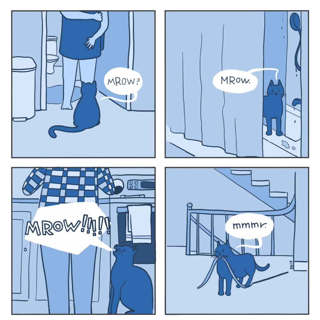
Since then, I’ve drawn a commission comic that was scripted by a friend, and then a lot of smaller, autobiographical slice-of-life-type things, mostly dealing with my cats. I’ve also written and thumbnailed a few more multi-page comics that just don’t get sketched, mostly because I lose the inspiration or time. Maybe someday I’ll go back to them.
For my Certificate in Graphic Design at MassArt, we actually had to do quite a bit of the copywriting ourselves. Thanks to my MFA, my copy got high marks during my final portfolio review. I’ve also done a lot of writing for my day job in marketing. This has been a bit more of the technical sort, usually cleaning up grammar and the sort, though I have been writing more marketing copy than I originally signed on to do. Being a graphic designer with an MFA in writing is really useful, and I know it will help me in my next endeavor, to find a different full-time job somewhere with more designers employed (other than, you know, just me!).
I’m so glad you discovered a passion for comics–one of my IS programs at Lesley was in Graphic Novels & Comics, and I really enjoyed the work I did for it. Even though I’m not much of an artist, it was so fascinating to learn about and utilize the different panelling techniques.
What is one of your favorite projects that you’ve worked on as a graphic designer?
I jump-started my graphic design career with volunteer work. A lot of professional designers will tell you not to give away too much of your time, and while I definitely understand that in the era of unpaid internships, the work I’ve done for the Bisexual Resource Center is essentially the bedrock of all the design I’ve been able to do since. I was already on their (grassroots, all-working) board of directors when I designed a t-shirt in 2015, and soon found myself doing just about everything (including a short stint as the President of the board, which I was glad to shed to get back to merchandising and graphic design).
My favorite graphic design project to-date was a complete rebrand of the company’s image, including their website, in 2020. I’d already developed the image of the bee (as in the B in LGBTQ), and we were selling stickers and buttons of the bisexual bee in many different pride colors. But a community survey of our website said that we weren’t necessarily representing the whole of the B community: those who identified as pansexual, queer, fluid, and other identities (we usually call it Bi+ to be inclusive). Also missing in our website were more images of people, especially people of color.
After several meetings with the board, research on other LGBTQ organizations’ branding and their representation, and iterations galore, I developed a new branding system that fulfilled the requests.
The final logo included colors from the bisexual and pansexual flags (the two most common personal labels that people in our community use), and the bee in the new logo is also more at rest with a more realistic shape. The website now includes photos of many people, more resources, and is more user-friendly overall.

I did a lot of writing for this as well as designing, and you can see examples of my work scattered across the site, such as on the Bi+ Info page. You can see the whole website at biresource.org, and all the merchandise at store.biresource.org.
What do you do to move past a writer’s (or artist’s) block?
To move past an artist’s block, first I have to realize where it’s coming from. For example, for the last few weeks I was blocked on a t-shirt design for an [upcoming] event. The impending doom of rush charges and printing fees I would inevitably face stalled me on it so that those fees and charges piled higher than Everest, or so I imagined. A friend going with me finally nudged me into completing the design a week out, and when I did contact a local printer he was able to give me a reasonable price, no rush fee. (All my love and future business to Villeside Customs in Somerville, MA.)
When I’m just stuck on how to start my design or how to compose an illustration, I have many reference options on the wide world of the internet. Design magazines and websites many times have galleries of design inspiration categorized into types like packaging, branding, and typography. I can search for and save favorite artworks on sites like Pinterest and Instagram. If I just need to remind myself what a potato masher or red-eared slider looks like, there’s always Google Images, and it’s also fun to root through book sales and Little Free Libraries for photo and art books to have on hand. And especially if I’m drawing something from nature, going outside is my best inspiration.
And then, I take a pencil and eraser (or pencil tool in a digital drawing program) to make warm-up sketches and draw through the block. The warm-ups don’t matter, because I can erase them, or trace over them, or go to a different page and start over. A lot of times I don’t actually clear the block until I’ve done several of these warmups, but sometimes I’ll get a hit on the first try, or copy part of what I’ve drawn to my final composition.
After I got my MFA in fiction and I was teaching Creative Writing at Lesley, I psyched myself out of writing. Writing blocks turned into just…not writing. I’d write something, get into a plot corner, and then question every idea I had for where the story could go next. I was so worried about getting the story to the *good* part that I forgot how to get it to the *done* part. And I forgot how to, to paraphrase A.J. Verdelle, be a child in the closet with my crayons for my first draft.
Sometimes I wonder what would happen if I sat down and really tried to write another short story, with ten years of life experience under my belt. Using the sketch layer first, of course.
The Lesley MFA program recently opened up an additional genre to study in the form of Graphic Novels & Comics. What benefits do you think writers could glean from studying the interplay of words and visual art?
As someone who writes sporadically to mostly make visual art, I’m delighted (and a little jealous) that this concentration was added. I might have thought seriously about concentrating in it when I was there.
I don’t know the requirements of the program now, but if all MFA students are required to take at least one sequential art class, I don’t see it as anything but beneficial. When I taught Writing and the Literary Arts to undergrads at Lesley, I had them read a graphic novel (Alison Bechdel’s Fun Home) along with longer prose works. I think it really helped them understand certain literary elements when they could see them acted out on the page in addition to reading them in prose. Similarly, I feel like different creative muscles are flexed when writing a comic versus writing prose, and that kind of cross-training has to be useful to everyone, if for no other purpose than to help with drafting: the literal coloring in the closet!
Are there any projects you are currently working on that you would like to share with us?
This spring, I finished a year-long project to provide concept illustrations for a friend’s children’s book. She’s currently looking for agents and wanted to see her ideas come alive, so I agreed to draw them for her. What should have probably just been sketches became full images, and I became quite attached to all these little animals and their friends and families.
Kate shares the concept art from a few of their current projects. Check out the video below!

Comments are closed